This
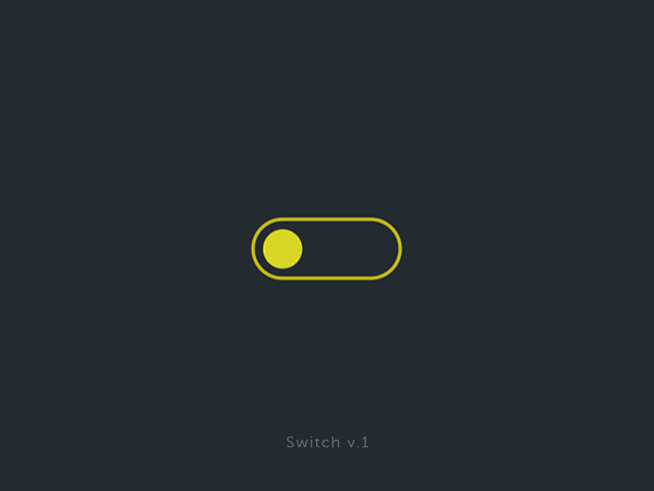
is a micro-interaction.
Today, it’s one of the most highly rated trends on the web, and it’s, for me, THE thing that sets an ‘ordinary’ site apart from an awesome site.
why
First and foremost, it’s a direct visual feedback to the user, indicating whether their action on the website (click, hover, or others) had any effect on its content. This guides them in their navigation, keeps them engaged, and prevents them from pondering whether what they just did is useful (and we know, it’s better not to make the user think too much).
Also, an element that may seem boring, and let’s be honest, not great (level up in the Quebec game for French), such as a contact form, can instantly become more valuable when its filling is smoothed out by micro-interactions. It could be a security bar that progresses as we enter our new password, or the label of an upload button that changes to ‘Uploading’ and then ‘Uploaded.’ In all cases, it’s a small visual detail that will make your user feel engaged and make the interaction elements of your website more ”human,” more ”alive”.
For example,
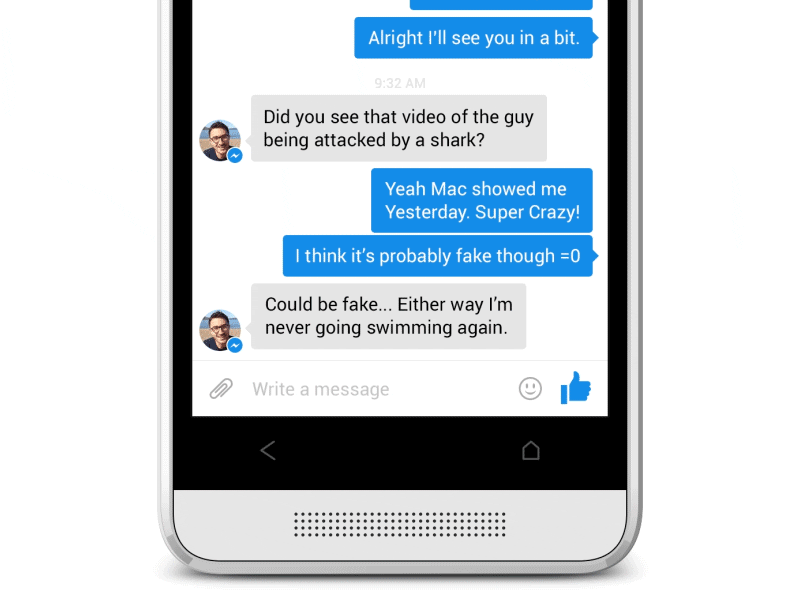
This interaction that Facebook offers gives us a sense of complete control over what we send. Beyond this, this social network offers a multitude of elements that we don’t even notice anymore because these micro-interactions have become part of our habits. It ranges from the shower of hearts that appears in your window when you send a ♥ (we see you, lovers) to the confetti that pops up when we type ‘Congratulations’ in one of our comments. Could you imagine Facebook without all these little touches of detail?
It’s an element that we often tend to overlook because it doesn’t really relate to our content. But precisely, the devil is in the details, and each of your users will greatly improve their experience.
so how do we go about creating a micro-interaction, tell me?
(Maybe too far on this one)
First, putting yourself in your user’s shoes is essential. Beyond fancy things, one can discover the utility of micro-interactions to present information in a better, more ergonomic, and more human way.
Take our custom cursor, the idea is to simplify the visualization of clickable elements on our website, as well as to offer something original. When you hover over a clickable link or button, the cursor changes its shape and provides additional strong feedback to our user without hiding the label of our link. In the future, a possible improvement would be to ensure that this cursor changes based on the link it hovers over (like a play button when hovering over a paused video, for example, clearly indicating that with a single click on it, you can resume playback).
The best is the enemy of good sometimes. – Rocky
You should definitely not start animating just for the sake of it. Staying simple will prevent you from losing a user who won’t know where to focus on a media that’s exploding, changing colors, moving, making noise, transforming, rotating, and… okay, I think you get the idea. Remember, these elements are guides first and foremost. Of course, we try to provide some fun to our visitors, add a bit more “wow” to a simple click, but we keep it restrained.
Conclusion
Think of the micro-interaction as a reward for the user, as an emotion you’d like to convey to them. We aim to make their task easier and simplify their life while playing on their browsing habits. In the end, you have a visitor who has had an experience with undeniable added value, one who will gladly return to your site or speak positively about it.
This reveals a benevolent image of your brand to your visitor. The satisfaction that comes from smooth, well-crafted, and clear interactions is unmatched in interface design. It immediately sets the tone and conveys a very clear message:
Our user: we love them, we flatter them, we pamper them.