You can now speak to a developer, but the other day, you had a conversation with a group of designers, and you just smiled and nodded the whole time?
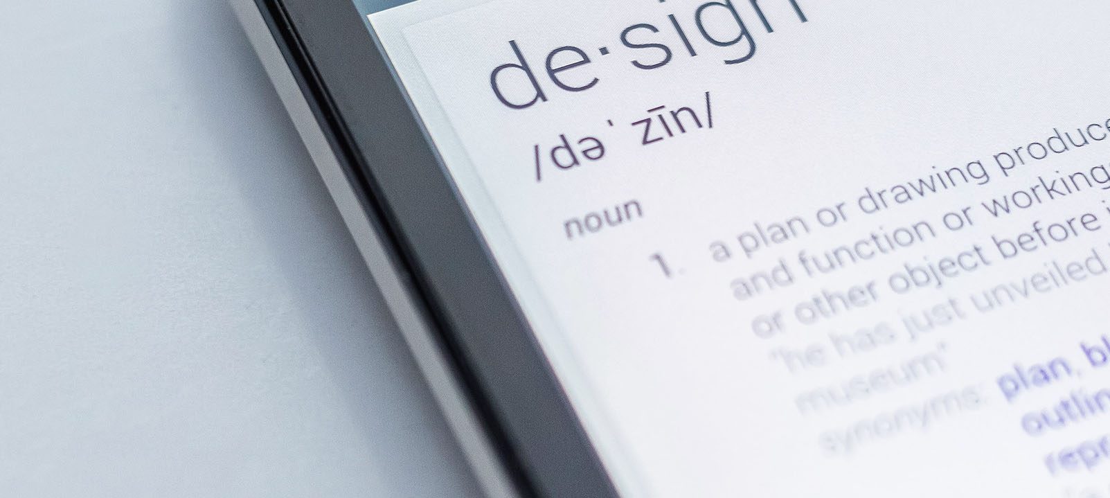
Is it pronounced “guif” or “jif”? You don’t understand why they’re talking about fonts, orphans, and widows? And do all designers know how to write in Latin? Don’t worry, here’s the Designer’s Little Robert edition.
Designer’s glossary
Adobe
Adobe (pronounced “Adobi”) is a company that creates software for artists to create various types of graphic, audio, or video content. The most popular software includes Photoshop (for graphic design), Illustrator (for creating vector illustrations), InDesign (for creating print materials such as posters or brochures), Xd (for user interface design), Premiere Pro (for video editing), and After Effects (for motion design and special effects).
Awwwards
Awwwards is a website that gathers and designates the best websites according to their standards. It awards the best site of the day, month, and year, in addition to other categories of awards. There are also CSS Design Awards and Webby Awards, which do virtually the same thing
Branding
A branding is the marketing practice of designing a brand image for a company. A brand encompasses several elements such as its logo, colors, tone of voice to communicate with its consumers, etc
Comic Sans MS
It’s a demonic and truly ugly font. Stop using it.
Crop
A crop is the action of cutting an image. For example, the image was 1920px wide and 1500px high, but I cropped it from the top and bottom to make it 1080px high.
CTA
A CTA or Call To Action
A call-to-action is a graphical element used to emphasize an action you would like the user to take (e.g., visit the “Shop” page or buy a specific product).
Definition/Resolution
Definition refers to the number of pixels on a screen (e.g., a screen with a width of 1920px and a height of 1080px), whereas resolution refers to pixel density on the screen (e.g., there are 72 pixels per inch).
Design system
The Design System is a library that gathers all the components, visuals, and reusable principles/codes of a graphical interface.
Design Thinking
Design Thinking is a working methodology for design that consists of 7 steps, which is collaborative and involves feedback from the end user.
DPI/PPI
DPI and PPI are measurement units that indicate the density of either dots per inch (Dots Per Inch) or pixels per inch (Pixels Per Inch).
Breadcrumb
Breadcrumb refers to a navigation component that displays the user’s path or hierarchy within a website (e.g., Home > Shop > Watches). The term “breadcrumb” is derived from Greek mythology.
Flat design
Flat design is a graphic style in which visual elements are minimalistic, and the use of solid colors and simple shapes is employed.
Font-weight
A font-weight refers to the thickness or heaviness of a font in a text. For example, thin, regular, bold.
GIF
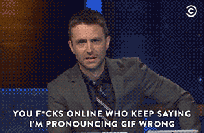
“GIF,” which stands for Graphic Interchange Format and is pronounced “jif” according to its creator (although most people pronounce it “guif”), is a digital image format that can only have 256 indexed colors, supports transparency, and allows for animated image sequences.
Graphic designer
A Graphic Designer is someone who creates graphic elements either on the computer or by hand.
Header/Hero
These are different sections of a web page. The Header is the top part of the page, typically containing the logo and navigation. The Hero area is a large banner located just below the Header and is used to highlight the most important element of the website (e.g., a call-to-action to go to the most important page of the site).
Helvetica
Helvetica is a sans-serif typeface created in 1957. It is one of the most widely used typefaces in the world (e.g., it is used in the New York subway) and is highly appreciated in the design community. It was designed with a specific goal in mind: to achieve the most refined optical harmony possible.
JPG
JPG is a compressed image format that reduces the file size of an image by adjusting the image quality to various levels of compression. It is a widely used format on the web.
Leading
Leading or line spacing is a term that refers to the space between lines of text.
Logotype
A logotype or logo is a graphic visual used to identify a company.
Lorem ipsum
Lorem ipsum is randomly generated fake text in Latin used as a placeholder text. It is used temporarily (until the actual content is integrated) to help with layout calibration and visualization.
PROTOTYPE
A proptype is the final visual rendering of an interface.
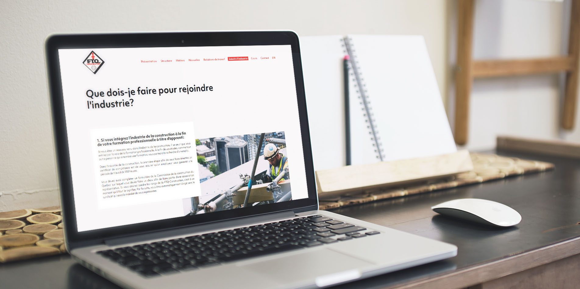
Mockup
A mockup allows presenting a graphical idea (e.g., a mockup of a website) in a real context. For example, here’s a mockup of the FTQ Construction website.
Moodboard
A moodboard is a style board that provides inspiration and gives an idea of the artistic direction.
Motion design
Motion Design refers to the art of creating animated graphic works. Movement is at the core of this artistic practice.
Orphan/widow
An orphan is when there is a single word on the last line of a paragraph. A widow is when the last line of a paragraph is isolated (e.g., the last line is at the beginning of the next page). Ideally, a designer will try to avoid these two elements, which can disrupt the user’s reading experience.
Pixel
The pixel, often abbreviated as px, is the basic unit for measuring the resolution of a digital raster image.
PNG
PNG is an image format with no loss of quality. This allows you to maintain a high-quality image, and this format also supports transparency, unlike JPG.
font/typeface/Typography
A “font” is a visual set of characters from the same family (e.g., the “Arial” font or the “Times New Roman” font).
A “typeface” refers to the set of characters in a particular style (e.g., “Arial” in bold and size 12).
Typography is the art of creating a typeface, whether for aesthetic or practical purposes. However, in common language, these three terms are often used interchangeably to refer to the font (e.g., the “Comic Sans MS” font is really ugly).
Prototype
A prototype is a version of a product that allows you to visualize the final version of it (e.g., a prototype of a mobile app containing all the interactions).
RGB(A)/HEX/CMYK/PANTONE
These are all color formats. RGB(A) involves calculating the amount of red, green, blue, and sometimes transparency (alpha) for digital use.
It can also be calculated in bits, resulting in a hexadecimal code (HEX).
For print, CMYK is somewhat similar to RGB(A). It calculates the amount of ink of the printing colors, namely cyan, magenta, yellow, and black.
Pantone colors, on the other hand, are standardized colors by the company of the same name for the printing industry. They provide a range of colors and samples (a color chart) to visualize how a color will appear when printed.
Serif/Sans-Serif/Slab Serif
These terms refer to categories of visual style in typography. Serif is for typefaces that have serifs (small, fine extensions) at the ends of characters. Sans-serif, on the other hand, means typefaces without extensions at the end of their strokes. Slab serif is somewhat like Serif, but instead of having fine, pointed serifs, characters have larger rectangular serifs. It’s sometimes described as a blend of serif and sans-serif styles.
Sketch
A sketch is a draft or a rough drawing of a visual idea. It allows for faster and simpler conceptualization of ideas, requiring only a pencil and paper. It should not be confused with the software “Sketch,” which is a design tool used for creating user interfaces.
Skeuomorphism
Skeuomorphism is a graphic style in digital design that involves imitating the appearance of a real object when designing a virtual one.
Sprint Design
Is a design process that focuses on solving user problems within a short timeframe, typically 5 days.
Stock photo
These are photos from image banks made available to people for various uses.
Tracking/Kerning
Tracking refers to the space between letters (letter-spacing) in a word or a group of words. Here’s an example of wide tracking: Hello World!
Not to be confused with kerning, which refers to the white space between two letters to achieve visual balance. For example, the kerning is different between the letters “AW” and between the letters “JL.”
UI/UX
The terms UI and UX are widely used, but what’s the difference? UI (User Interface) encompasses all the visual elements of a digital product (e.g., icons, buttons, forms, etc.). UX (User Experience) refers to the overall user experience, meaning how the user’s experience with my product (app, website, or other) will be. I’ve already written an article on the difference between UI and UX if you want to delve deeper into your knowledge.
User flow
A user flow is a diagram that shows the possible actions and paths a user can take when using a product. It helps determine if the overall process makes sense and what options are available to the user.
Vectorial
Vectorial is a digital image format that consists of vectors to create various geometric shapes (polygon, circle, rectangle, etc.). Unlike pixels, this format is based on mathematical calculations and allows it to be resized indefinitely without losing quality.
Web designer
A web designer is someone who designs the visual/interface of a website using various graphic design tools.
Wireframe
A wireframe is a version that’s more faithful than a sketch but still not the final version of an interface. It’s a diagram that shows areas and components in the form of sketches. Typically, it will be in shades of gray and without images.
WYSIWYG
WYSIWYG (pronounced “wiziwigue”) is the abbreviation in English for What You See Is What You Get. It literally means “what you see is what you get.” It’s a term that refers to a user interface that allows for the visual composition of the desired result. The user directly sees the final result when interacting with it, similar to a mini Word or Pages.