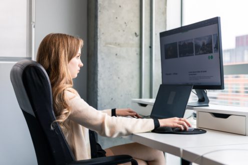
The homepage is the initial point of contact between a user and your company, making it the most crucial page of your website. It’s easy to understand that the majority of a website’s traffic is focused on this page, and therefore, it shouldn’t be overlooked. This initial impression will be decisive in determining whether the user will continue navigating your website to the purchase/contact process or not.
knowing your customer and putting yourself in their shoes.
The persona method, which we will discuss in another article soon, is a great way to understand the journey that a target user will undertake on your website. This makes it easier to identify which interactions this user expects to find on your homepage and, most importantly, what essential information should answer their questions.
Beyond understanding the user’s desires, the persona will provide you with the information you need to build your site in general: what is the purpose of my site? What can I do on it? What is its value to me? Why should I buy a product/service here rather than elsewhere? These are the four crucial questions your homepage must answer, and you should constantly ask them while putting yourself in the shoes of the typical user.
Keep in mind that the goal of your homepage is to go beyond the few seconds during which the user will go through the various important elements of your homepage and then decide whether to continue navigating your site or check out the competition (yes, it’s that fast).
define the primary action.
The more choices of action on your page, the greater the chance that you’ll lose your user, and they’ll leave your site. This is called the paradox of choice, and it should drive you not to overwhelm your user upon their arrival at your site. Be aware of the path you want your user to take and ensure that a maximum of elements guides them in that direction.
When a new user lands on your homepage, they should be able to feel a connection with their desires created by the elements that compose it. Calls to action suggesting they learn more about the various components of your product or service will be more effective than simple “buy this product” or “sign up,” which often repel the user more than they assist them in their quest for answers.
In summary, your primary action should be able to address the user’s primary questions while inviting them to learn more.
Enhancing your page with beautiful visuals.
Whether through videos, beautiful animations, or carefully crafted images, high-quality visuals will please and keep your user engaged for longer. However, be mindful that these visuals bring meaning and added value to your message. It’s not about adding images just for the sake of aesthetics but rather about considering how they complement calls to action or explanatory text. It’s best to showcase your product on the very first page or explain your service through a brief introductory video with a link to learn more. The advantage of an image is that it can convey one or multiple messages much faster than text.
A picture is worth a thousand words, but don’t forget the text!
Often, when we envision our homepage, we tend to picture a large slider that takes up all or part of the page with big headlines and a button to guide the user to other parts of the site. While this option aligns well with the points mentioned earlier if carefully designed, neglecting the text on a page, in any context, significantly reduces its search engine ranking. Therefore, it’s essential not to forget to include more text-based sections (which can be accompanied by images) to maintain a good content quality in the eyes of Google.
optimizing your load time
When we visit a website, and its load time leaves much to be desired, it doesn’t take much effort for us to look elsewhere, and that’s what your user will do. Beyond optimizing your search engine ranking, improving your load time to make it minimal significantly reduces the bounce rate (a rate calculated on the average of users who leave the site within a few seconds of visiting) that your site may experience. This greatly enhances the user experience and has a direct impact on the number of your visits that convert into purchases.
ensuring that the page evolves
Finally, a good idea to improve the design of your homepage is not to be afraid to change elements and evolve it constantly. Given that it’s the first page your user will see, it’s more than important to take note of the feedback you receive. Also, including evolving elements like a link to your blog articles and a summary of the last 3 published articles is an easy way to build customer loyalty and show that you are active.
Conclusion
Your homepage is undoubtedly the most important page of your website. It should neither be empty nor filled with superfluous information. You must be clear, precise, and, most importantly, invite your user to continue their navigation on your site. Imagine that your homepage is the moment when your customer enters your store, and from the very first contact, you must show them that your business is serious, leaves nothing to chance, and treats its customers in the best possible way. If your homepage can make your user feel at ease in this manner, you will have won everything.