Colors are literally everywhere around us. Without us being aware, they have an impact on our mood and our perception of things. While colors are among the most important foundations in design, they are often taken for granted.
So today, I volunteer to give you this quick 101 lesson on colors in design. Enjoy your reading!
PRIMARY, SECONDARY AND TERTIARY COLORS
primary colors
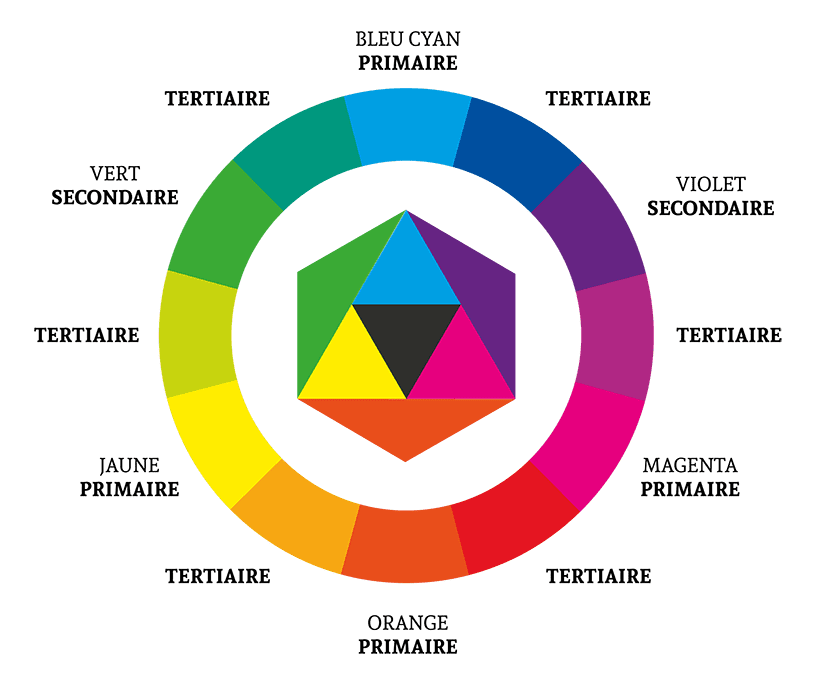
The primary colors form the basis of the color wheel (the name given to the circle that groups colors). These are the colors that make up all other colors and cannot be created from other colors. In this case, they are cyan, yellow, and magenta.
SECONDARY COLORS
Secondary colors are the colors created from primary colors. In this case, we are talking about purple, red, orange, and green. Green is a mixture of yellow and cyan.
TERTIARY COLORS
Tertiary colors are the colors created from a primary color and an adjacent secondary color. In this case, they are the colors green-blue, yellow-green, orange-red, and purple-magenta.
impression (CYMK et Pantone)
In printing, the basic color system is CYMK, which stands for Cyan, Yellow (Jaune), Magenta, and Key (Black/Noir). These colors make up the primary colors (as discussed in the previous point) used in print where printers mix different ink shades to create posters or other printed materials.
There is another color system in printing called the PMS, which stands for Pantone Matching System. It is developed by the Pantone company, which creates its own colors with its own processes to provide a more extensive color palette (since they use 6 channels of primary colors compared to CYMK’s 4). This system offers more color choices but is much more expensive. PMS is, therefore, more commonly used in luxury contexts.

DIGITAL (RGB/HSB/HEX)
DIGITAL FORMAT RGB
For digital, the primary colors of pixel screens are RGB, which stands for Red, Green, and Blue. This allows calculating the amount of red, blue, and green between values 0 and 255. So, to get blue, you would calculate as follows: 0 (no red), 255 (100% blue), 0 (no green).

DIGITAL FORMAT HSB
Another way to calculate a color in digital is in HSB, which stands for:
- Hue (teinte) calculated on a scale from 0 to 360 degrees on the color wheel;
- Saturation (saturation) ranging from 0 to 100, indicating whether the color is vibrant or closer to a shade of gray;
- Brightness (luminance) placed between 0 and 100 on a scale from dark to pale.
To get red, for example, you would use 0, 100, 50.
DIGITAL FORMAT HEX
Finally, the hexadecimal format is a number that represents the quantity of red, blue, and green (similar to the RGB format) but calculated in base 16 (0 to 9 and the first 6 letters of the alphabet) rather than between 0 and 255.
So, the color green would be expressed as #0000FF. Here, the first two characters are for red (00), the next two for blue (00), and the last two for green (FF).
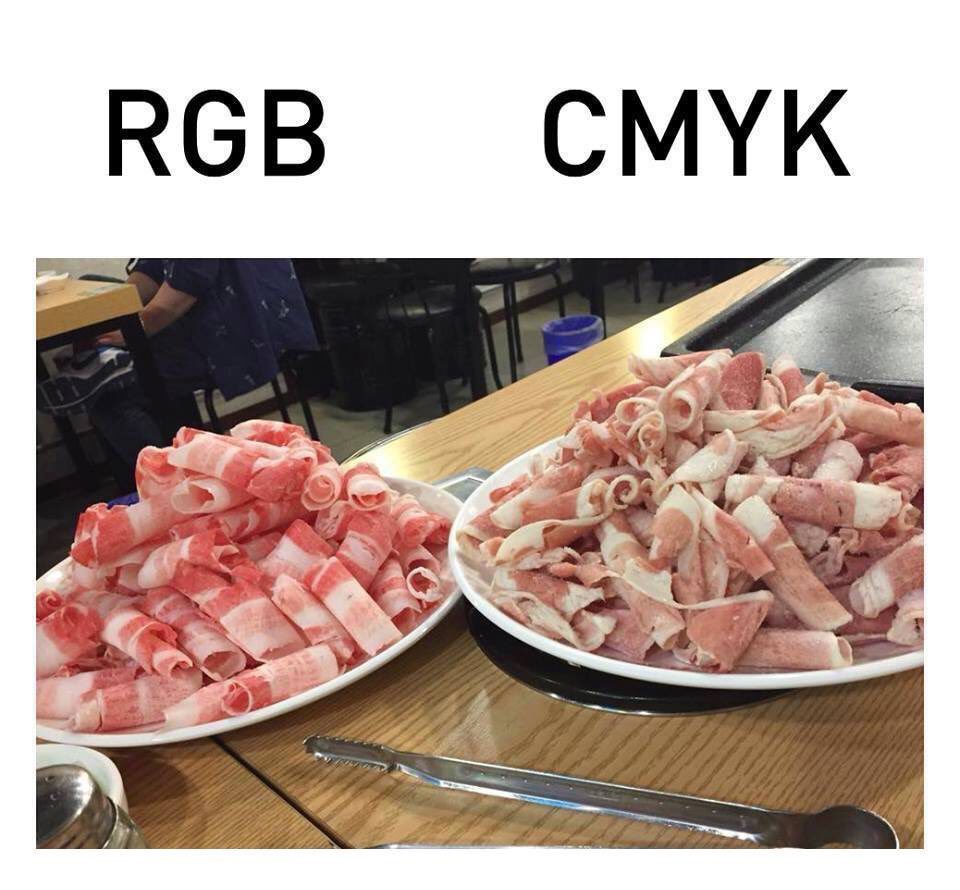
One of the advantages of digital colors is that it’s possible to easily achieve vibrant colors, whereas in printing, this is not always possible. (See the example below)
COMPLEMENTARY COLORS
Complementary colors are colors that are opposite each other on the color wheel. For example, in this case, orange is the complementary color of blue. If you’re looking to create a color palette, complementary colors are always a good choice!

THE TRIAD
A triadic color palette represents three colors that are equally spaced in the color wheel.

monochrome
When we say that colors are monochromatic, it means that the color palette used consists of a single color hue but with variations. In the image below, the image is composed only of green, but with different saturations and brightness levels.

WARM/COOL COLORS
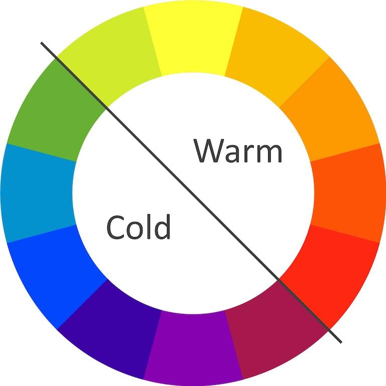
Warm and cool colors each represent half of the color wheel. Warm colors (e.g., the red-orange of fire) evoke energy and warmth, while cool colors are more associated with calmness and freshness (e.g., the blue of a snowy landscape).
color psychology
Whether we like it or not, colors have a strong influence on us and alter our perception of the elements around us. When politicians dress in certain colors or when the visual identity of a brand or product is composed of a color, they are not chosen randomly. The choice of colors is thoughtfully considered to create the desired impact in the subconscious of the audience. We have provided a summary of the meaning of some colors:
red
Red is one of the most vibrant colors and expresses passion, love, power, urgency, and can even make us hungry (e.g., McDonald’s uses red in its branding). On a website, this color is often used to grab attention and create a sense of urgency.

Orange
Orange often represents extravagance, energy, dynamism, warmth, and joy.

yellow
The color yellow is associated with positive concepts such as optimism, youth, and creativity. It’s the yellow of the sun, gold, chicks, and smiley faces.

PURPLE
Purple is the color of royalty and carries a strong religious connotation. Based on the symbols associated with this color, it imparts a sense of mystery. It’s also the color of shadows, symbolizing power, nobility, luxury, and extravagance. Purple is further linked to wisdom, dignity, independence, creativity, magic, and eroticism.

BluE
Blue is often associated with loyalty, reliability, calmness, expertise, stability, honesty, freshness, communication, and trust. Blue has the unique quality of being both the favorite color of men and women. It’s therefore common to see it frequently used in various brands (e.g., Facebook, Listerine, law firms, startups, etc.).

GREEN
Green has a strong association with nature, organic and healing, as it’s the color of plants, grass, trees, etc. It also carries a certain connotation of wealth and growth since it can be linked to ‘greenbacks’ (money).

black
Black (if considered a color) can have a darker and negative connotation (night, darkness, depression, the unknown, and fear). Just think of black holes, horror movies, or a black cat bringing bad luck. However, it’s a color that can also have a positive connotation through formality, strength, seriousness, and luxury. For example, think of Uber positioning itself as a VIP private driver service for everyone.

white
Just like black, it’s debatable whether white is considered a color. White is primarily associated with the positive, as it is often linked to goodness, purity, safety, cleanliness, and light. Think, for example, of a hospital or an angel.

Attention!
Here are some guidelines to keep in mind when using colors.
60-30-10
There’s the 60-30-10 rule, which states that to have a well-balanced color palette, you should have 60% of a dominant color, 30% of a supporting color, and 10% dedicated to an accent color that draws attention to specific areas. Like any good rule, it’s not absolute, so it’s not necessary to have only 3 colors in your palette.
Contrast
Watch out for contrast! It’s important to have combinations of colors that ensure good readability and, thus, make the content more accessible, especially for visually impaired individuals. The best contrasts are between black and white, followed by complementary colors. There are several online tools to help you calculate the contrast ratio. In web design, it’s even more crucial to have an acceptable level of contrast to comply with accessibility standards.
web accessibility standards (WCAG).
color blindness
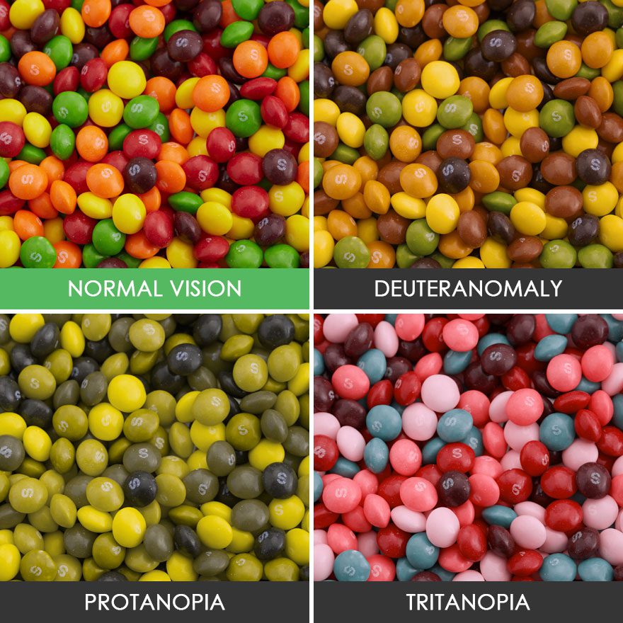
Approximately 8% of men and less than 1% of women have color blindness, which hinders their ability to perceive certain colors accurately. Therefore, it’s important to remember and acknowledge that some people see colors differently. In such cases, it’s possible to use certain tools to simulate how your visual will be viewed by individuals with various types of color blindness.
Context and culture
We’ve discussed the meaning of certain colors, but it’s always essential to consider the context in which a color is used because a color can be perceived differently depending on the context and culture. For example, yellow, often associated with joy, also has a meaning of mourning and death in Mexico (just look at the Day of the Dead). In short, knowing your audience and being informed about the culture in which you are conveying your message can always be beneficial.
And there you have it! You’ve now become a color Picasso (or close to it ). Despite colors being everywhere and sometimes seeming mundane, we must not underestimate their complexity and impact. When it comes to choosing a color, take the time to make the right choice, as it will make all the difference in your visual communication.
