Julie Snyder cuisine

Julie Snyder Cuisine
Food
WordPress
Showcase website
2022


MandatE
Julie Snyder Cuisine commissioned us to create a showcase website to support the brand in its marketing efforts.
The project aimed to design a business card that would help build brand awareness and increase the visibility of Julie Snyder Cuisine. The team also wanted to use the platform to publish various content (recipes, new products, promotions, news, etc.)

A branding realized by Paprika
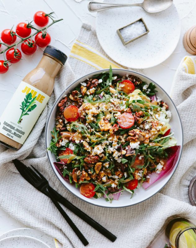
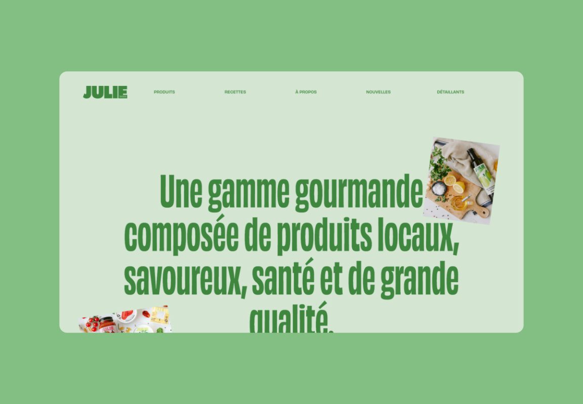
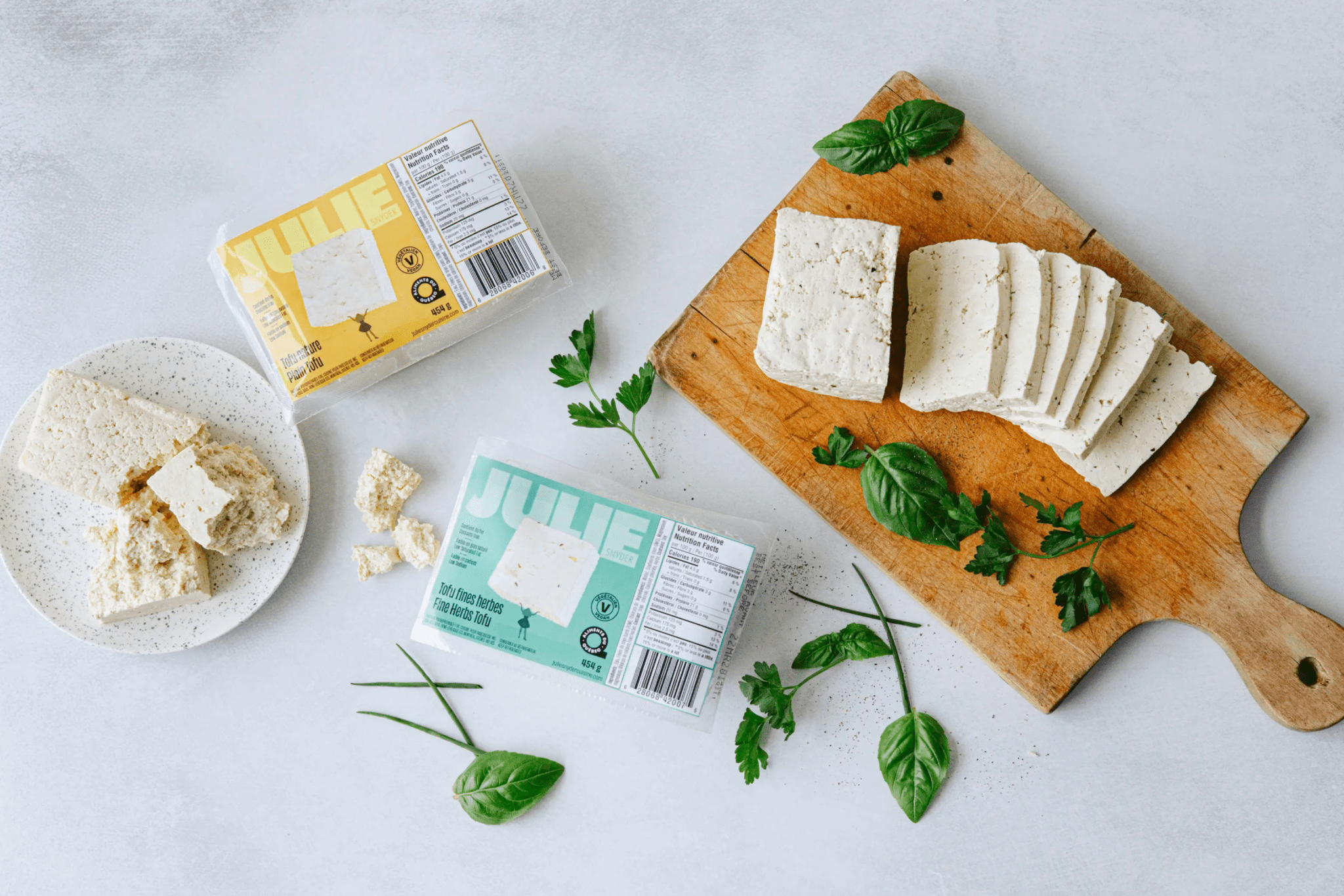
Healthy, made in Quebec, vegetarian, and easy-to-cook products, plain and simple!
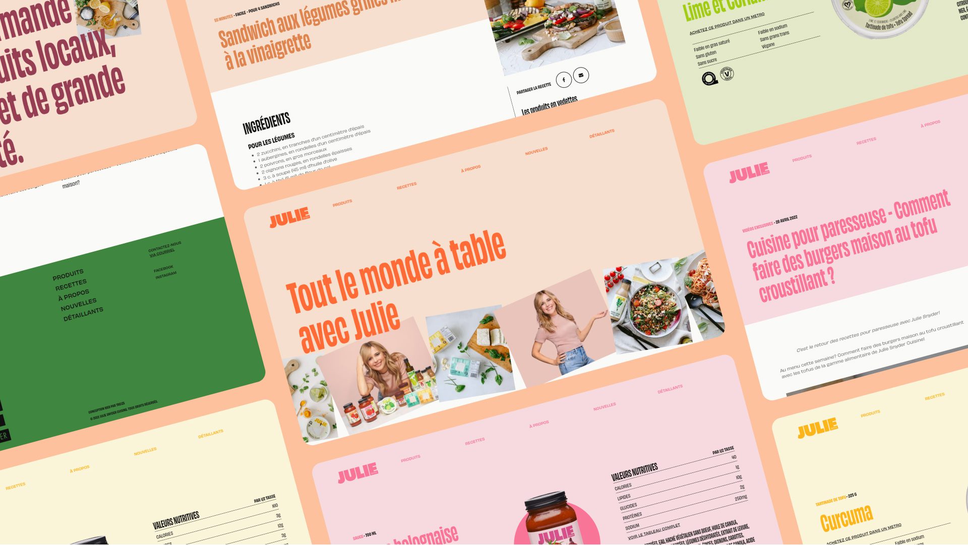
Random color system
The Julie Snyder Cuisine brand is colorful and embodies the extravagance of its founder. The brand presents itself with a diverse and inclusive color palette to communicate to the wide audience it aims to reach. To provide users with a vibrant experience, we decided to leverage all the brand’s shades by implementing a random color system. With each click on a new page, the user is immersed in a page of a completely new color selected randomly. During a second visit, the colors will change once again, offering each visit a unique and eye-catching experience.
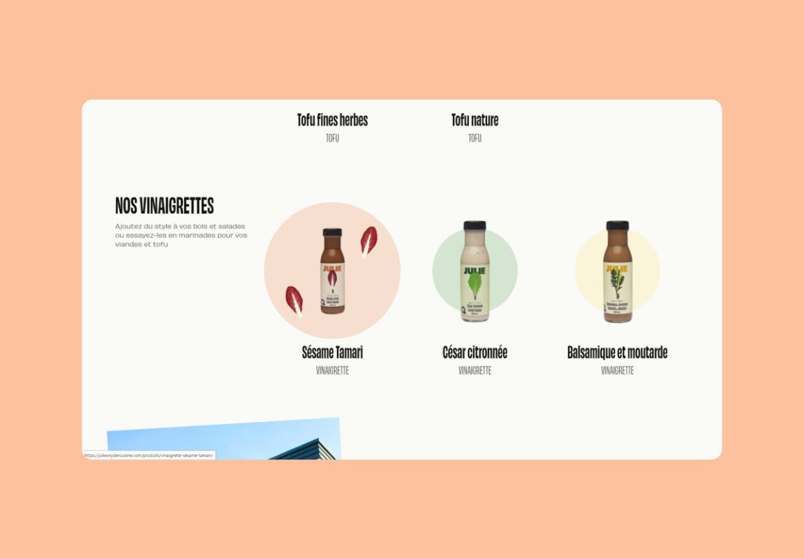
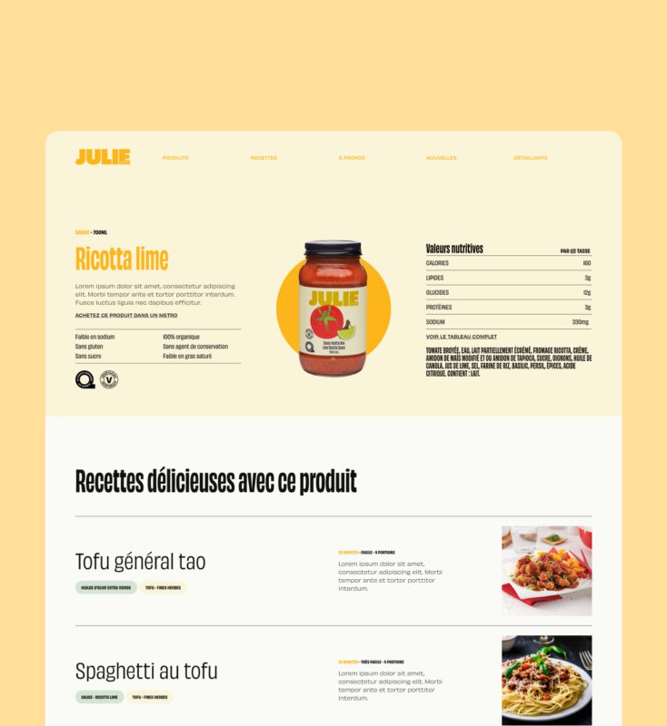
A clever showcase of products
Few consumers spend a significant amount of time shopping online for their next jar of tomato sauce. In order to optimize every second of browsing and provide a relevant product showcase, we created a concise and eye-catching product overview that addresses the most common questions from our various target audiences (from the curious to the seasoned vegetarian). The product pages also provide access to the transactional platform of Metro mon épicier.
We believe in a lot of things but simplicity is one our dearest principles
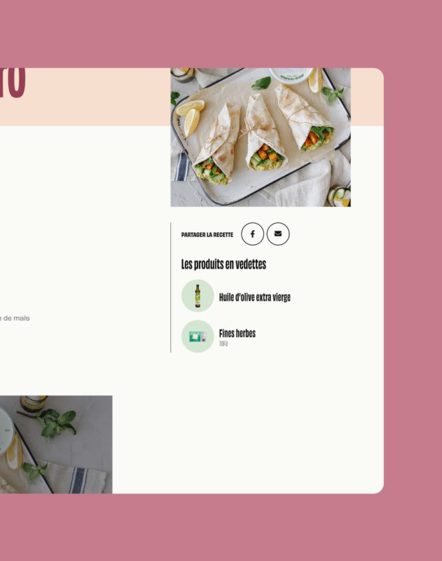
The recipes also allow for quick access to the product sheets featured in the recipe
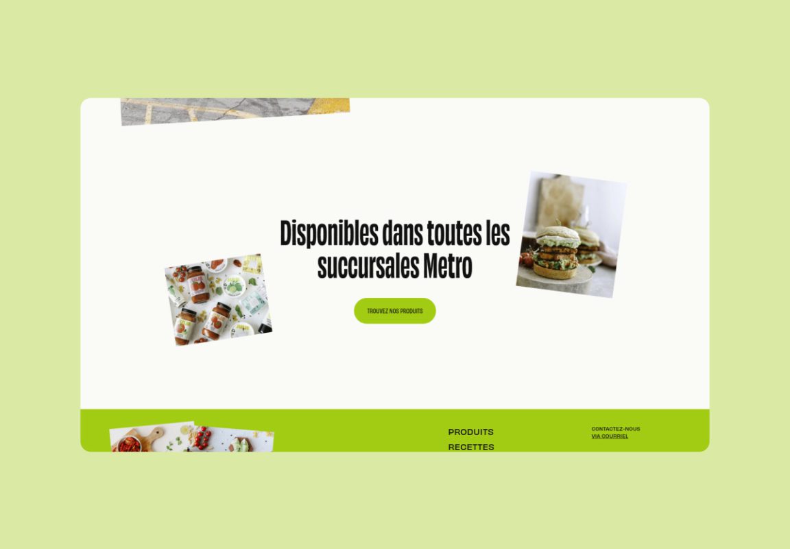
Positioning of an accessible and unifying brand.
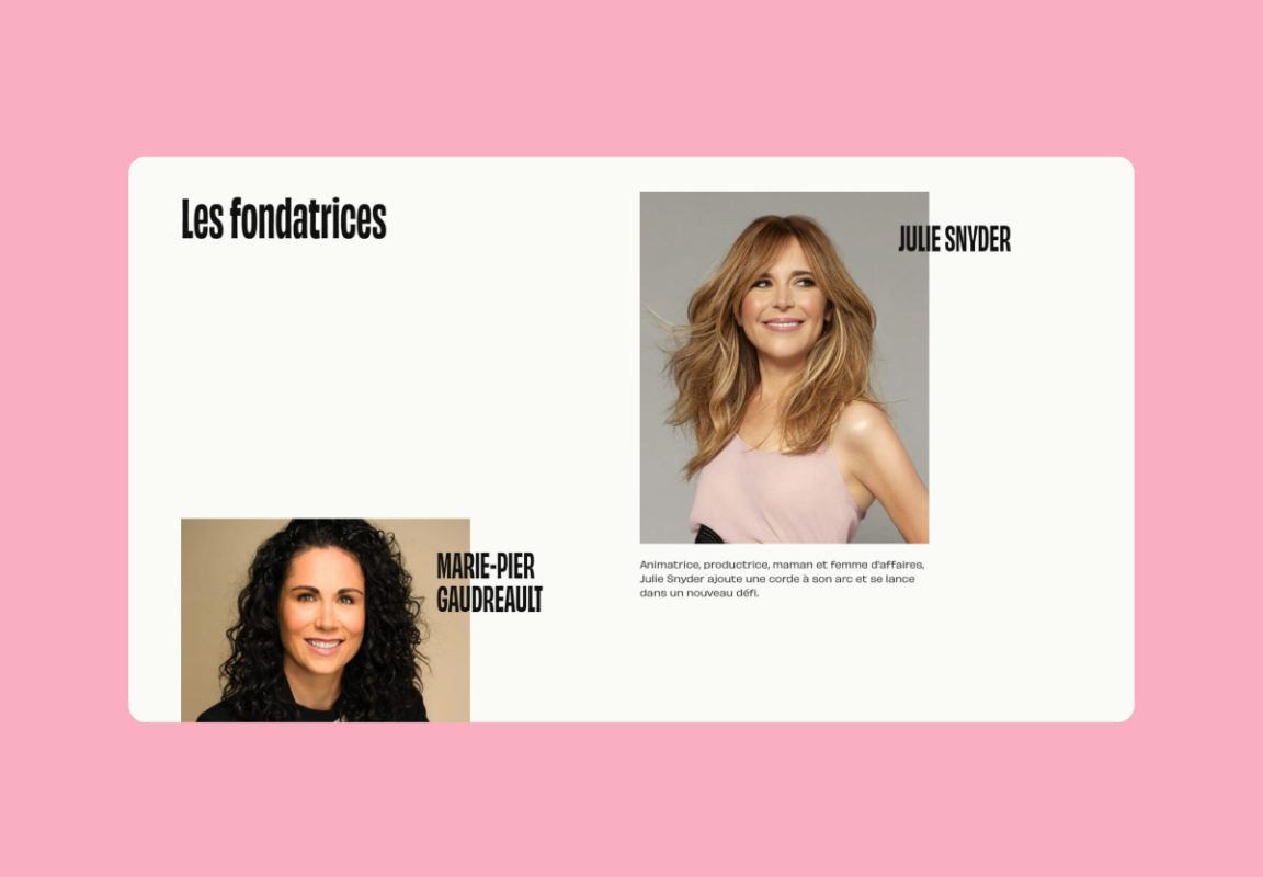
The business card had to quickly convey to a broad audience that Julie is more than just a TV personality. Food products and Julie had to be quickly and cleverly paired to demystify the essence of the company.
The interface also had to remain accessible above all to reflect the brand of products. The imagery supports the brand’s positioning, while simple yet impactful animations convey its dynamism without disrupting the smooth navigation that will even appeal to digital newcomers.
The tone used on the website also reflects that of an accessible and relaxed brand. A playful nod to humor can be seen in how the recipes are categorized based on difficulty levels: easy, very easy, for the lazy.