Collège Laflèche

Collège Laflèche
Education
WordPress
3D Visits
Showcase website
2022


MandatE
In order to translate its new identity onto its web platform, create a more intuitive information structure, and modernize the website’s features, College Laflèche entrusted us with the complete redesign of their website.
StratEGY
The primary functional goal of our digital experience was to assist prospective students in their search for and selection of a study program that meets their needs.
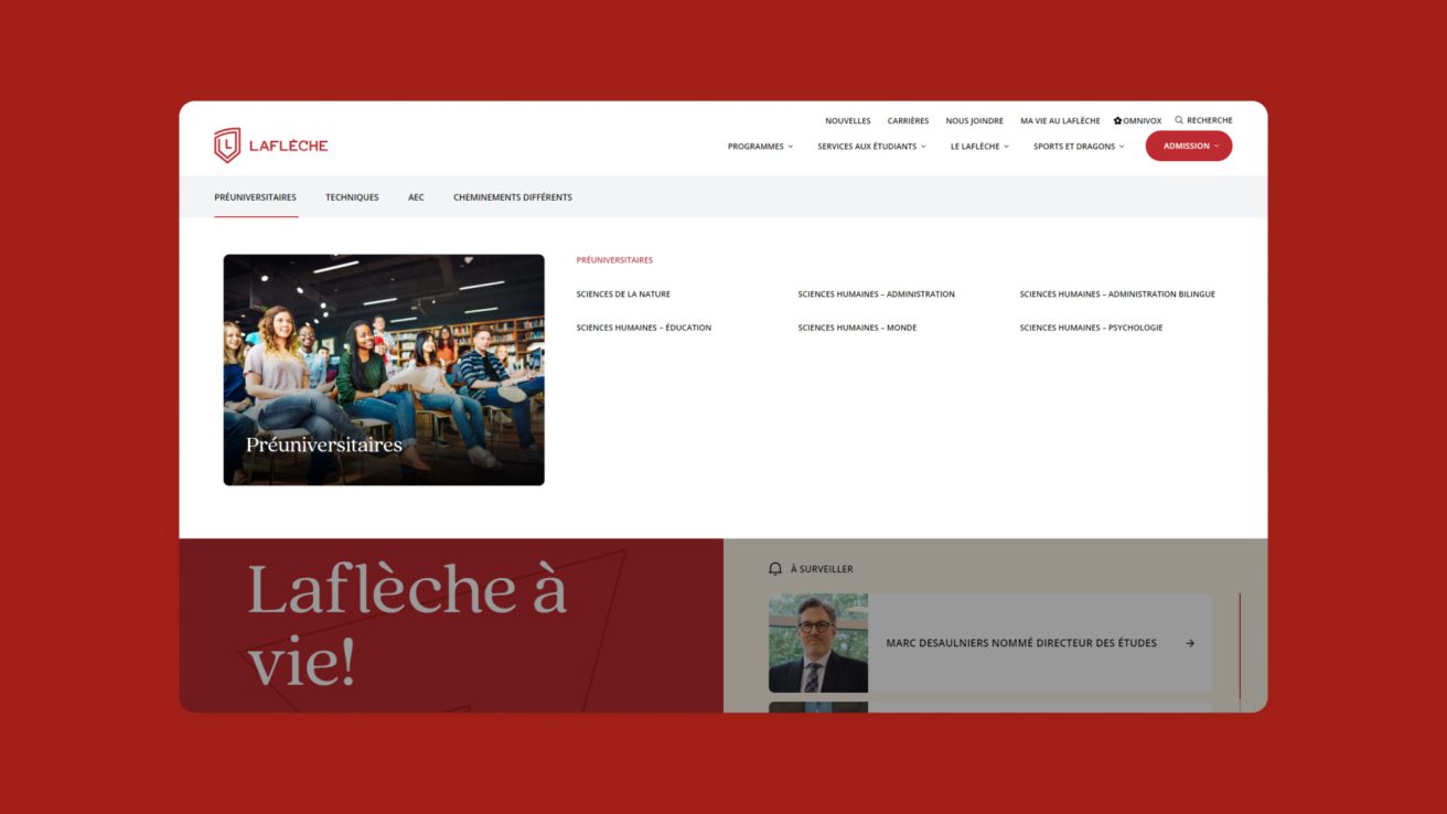
Therefore, we aimed to empower prospective students with the ability to explore various options on their own, making it easy for them to find answers to their key questions. The information structure was carefully thought out and designed accordingly. To facilitate user research to the fullest extent, several search features were developed: multi-filters, a search bar, categorization, as well as a mega menu.
A PRACTICAL PROGRAM CATALOG
The choice of a college study program is a very important and challenging decision for prospective students. When you’re in high school, it’s easy to feel lost among the variety of program types and options. Should I choose an AEC, a technical program, or a pre-university program? What’s the difference? If I like science, which program should I choose?
To better support the target audience in their decision-making process, we have created a catalog that provides clear definitions for each type of program. This allows prospective students to search for a study program based on their interests or desired path. An iconography system has also been developed to make it easier to identify programs of interest.
INFORMATIVE PROGRAM SHEETS
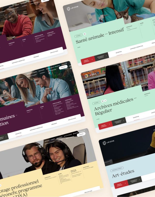
Selecting a study program also involves taking a keen interest in all its details to make an informed choice. We first got to know prospective students to better understand the information they seek when it comes to program selection, including the admission process, employment prospects, prerequisites, and more. An information hierarchy was established to swiftly address their primary questions. Several elements were also integrated to facilitate information retrieval: iconography, labels, informative tables, secondary navigation, and more.
Scolarship search system
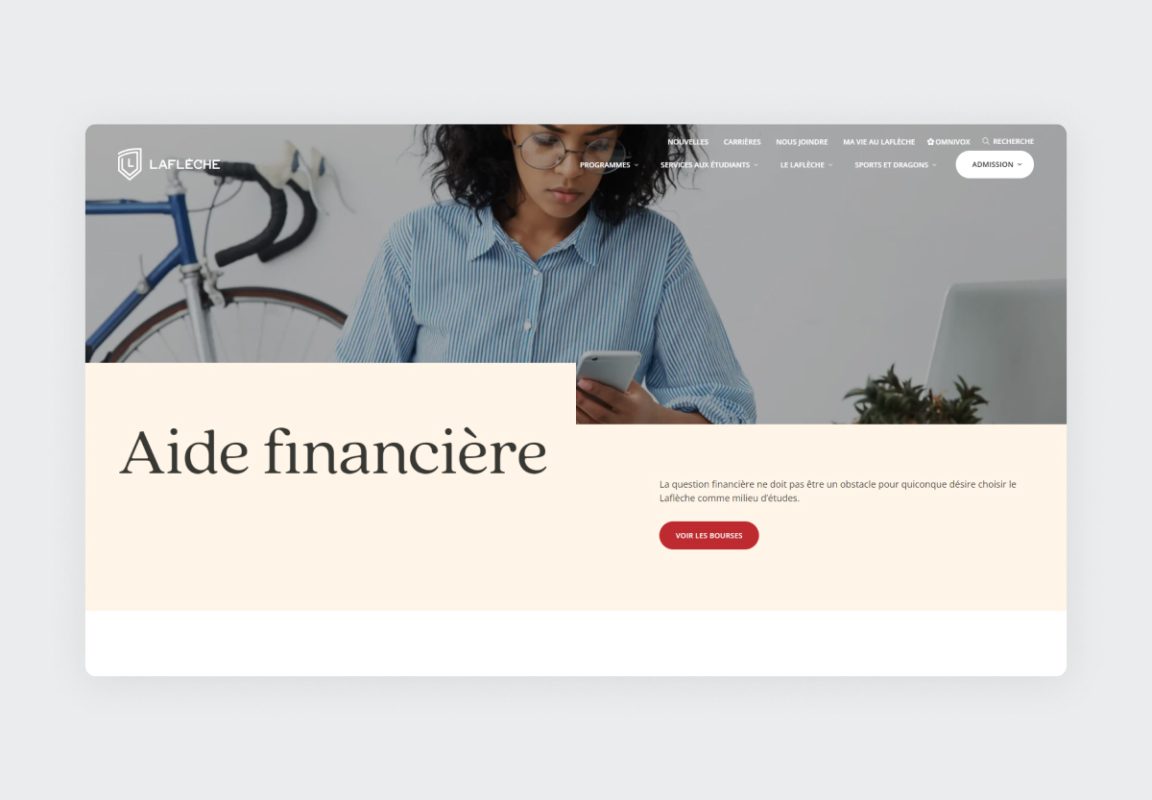
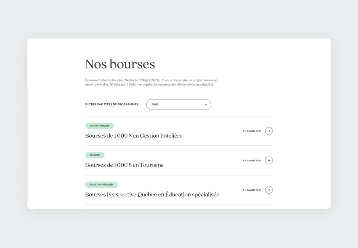
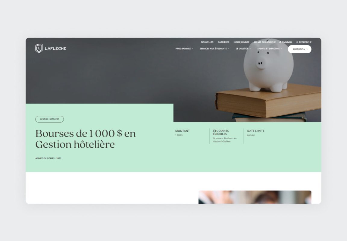
Many prospective students and parents are concerned about the expenses associated with a private school. However, Collège Laflèche offers an impressive variety of scholarships to financially assist students. We wanted to ensure that students could easily find a scholarship for which they would be eligible. Therefore, a filtering system was set up to allow students to find a scholarship based on their study program. Each scholarship now has its own page, which improves SEO and enables program administrators to easily share scholarship details (URL) with students.
AN INTUITIVE AND VISUAL NAVIGATIOn
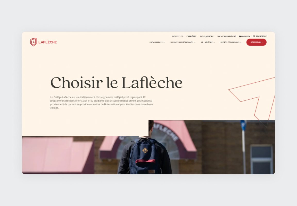
A school institution also entails a wealth of information, links, and documents to host. It was essential for us to create an intuitive navigation system that would cater to everyone’s needs. To achieve this, two levels of navigation were developed, a visual mega menu was implemented, and an informative footer was constructed to consolidate all navigation links.
A HUMAN-CENTERED DESIGN
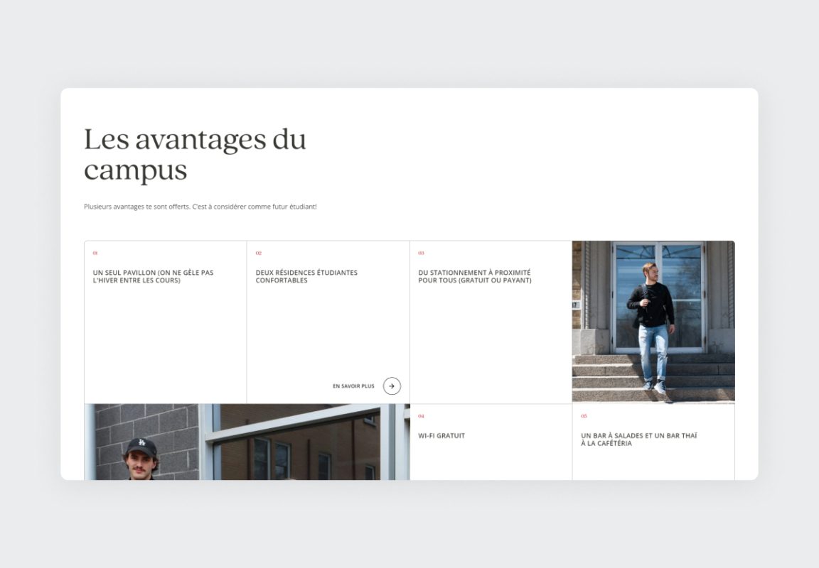
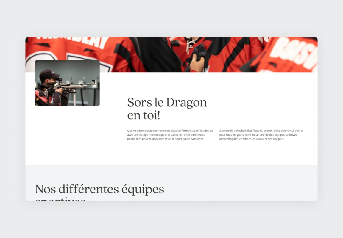
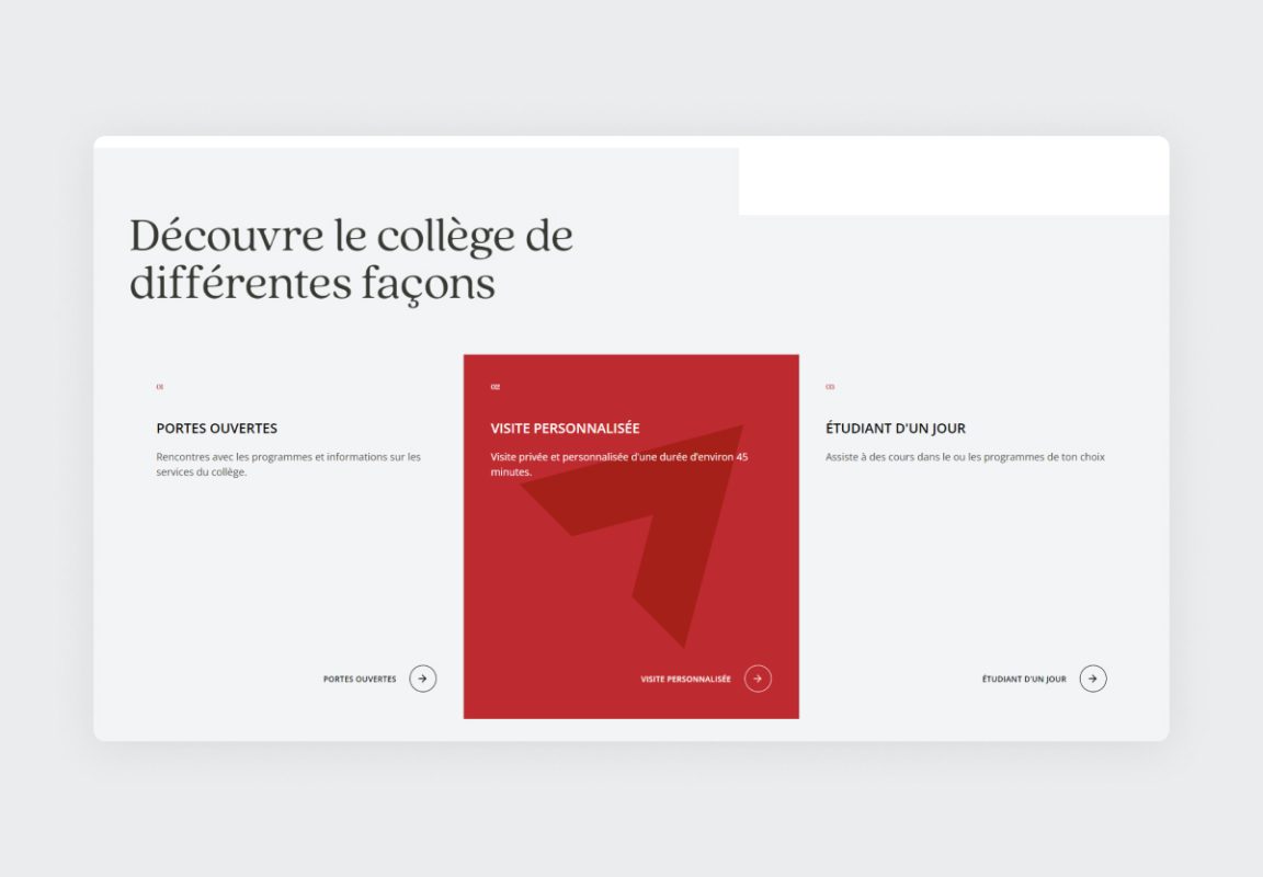
“Laflèche for life!” is Laflèche’s slogan, and it’s not without reason. It’s a human-centered college where staff and students build incredibly positive and enriching relationships, and when they choose Laflèche, it’s for life. We genuinely felt this joy of life 100% with our clients, who wear their college on their hearts and always have a smile on their faces. We had no choice but to create a user interface design that always keeps the focus on people. Therefore, we opted for image-centric programs and large photos of real students in their real living environment. Rounded shapes and the overlay of elements were also used to convey the college’s friendly and approachable aspect.
