

Construction Di Paolo

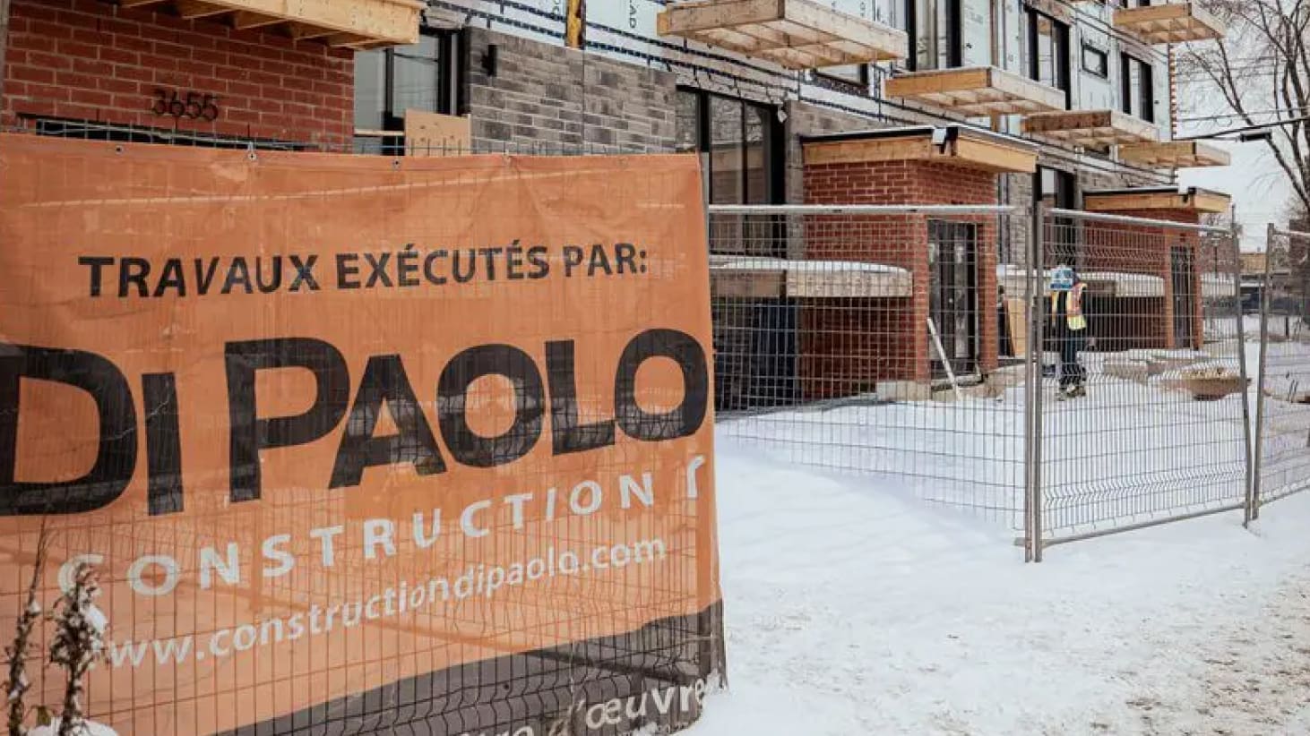
Construction Di Paolo
Construction
WordPress
Artistic direction
2026



Our Mandate
TREIZE took charge of the complete website redesign: strategy, artistic direction, WordPress development, natural referencing, and deployment. The parameters of the mandate were very clear: a modest budget and an efficient timeline.
We had to represent Di Paolo’s brand new identity on their new website, while reviewing the site structure and navigation. A breath of fresh air to allow this company, with over 40 years of expertise, to shine on the web, while maintaining its previously established reputation.
TREIZE took charge of the complete website redesign: strategy, artistic direction, WordPress development, natural referencing, and deployment. The parameters of the mandate were very clear: a modest budget and an efficient timeline.
We had to represent Di Paolo’s brand new identity on their new website, while reviewing the site structure and navigation. A breath of fresh air to allow this company, with over 40 years of expertise, to shine on the web, while maintaining its previously established reputation.
- Deploy the first digital version of Di Paolo’s new brand identity
- Simplify navigation to better reflect the company’s expertise
- Highlight expertise and achievements
- Generate quality leads
Objectives
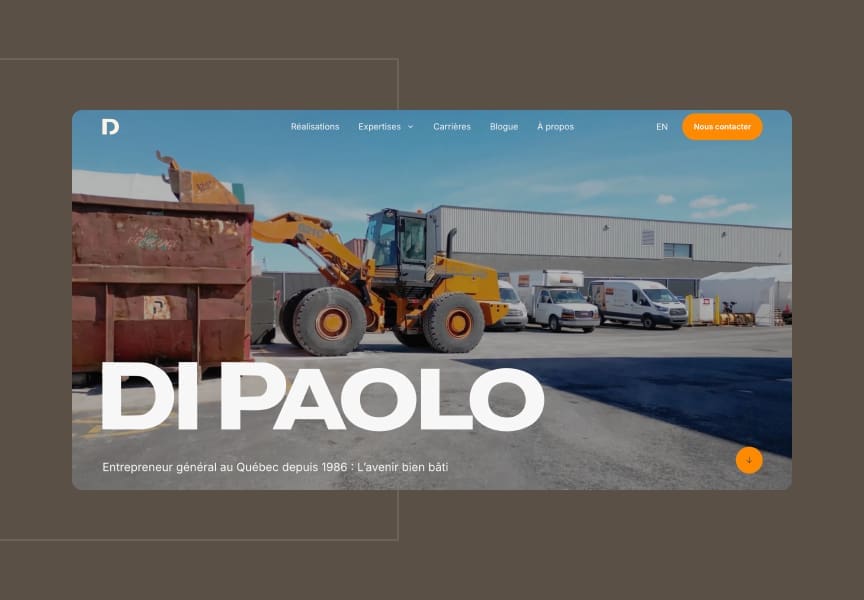
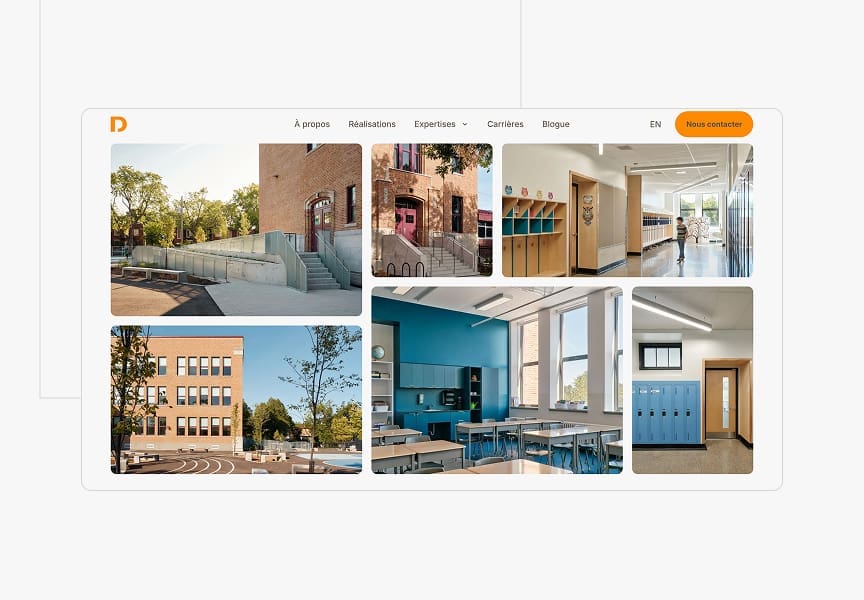
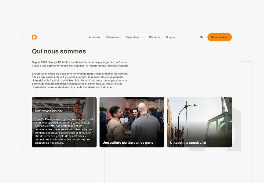
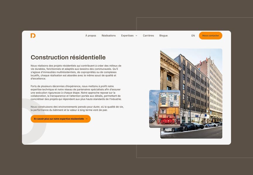
A Brand Identity That Comes to Life Online
For a company that has existed for 40 years, changing its image is not an easy exercise. The website became the first place where this new identity would be seen by clients and partners, so the transition had to be clear and coherent. The integration of a new symbol at the heart of the new brand identity proposal became Di Paolo’s main signature.
The artistic direction of the website was therefore based around this new signature to highlight it effectively. The symbol was used in several strategic locations to add depth to the classic solid color backgrounds. The use of tone-on-tone allowed us to incorporate it without cluttering the site’s visual design too much.
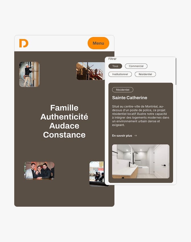
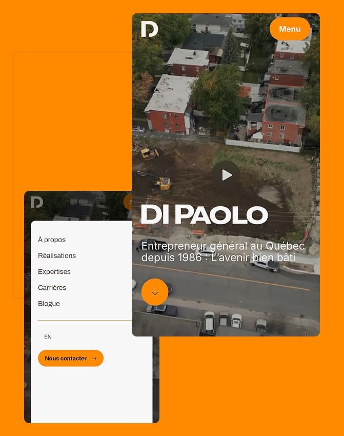
Navigation Designed for Essential Information
With three main types of projects (institutional, commercial, residential) and 40 years of achievements to present, the risk was to overwhelm visitors with information. In this case, less is more. We opted for a simplified site structure, where each section has a clear place and a direct path.
On the development side, the site is fully responsive and based on a structure of reusable modules, which ensures a consistent experience on mobile and desktop, without multiplying the templates to maintain in the future.
Effective and Efficient
A modest budget should never equate to an average result. The challenge here was to prioritize.
To offer Di Paolo a site that delivers the essentials: a strong new image, clear navigation, a functional careers section without multiplying superfluous features that would have inflated costs. We can say: mission accomplished! Although the website is simple, it perfectly meets the needs of Construction Di Paolo (and their current and future clients) in addition to accurately reflecting their new brand identity. All this to say that, sometimes, less is more!
