Trampoline AI


Trampoline AI
Artificial intelligence
Artistic direction
2025


Mandate
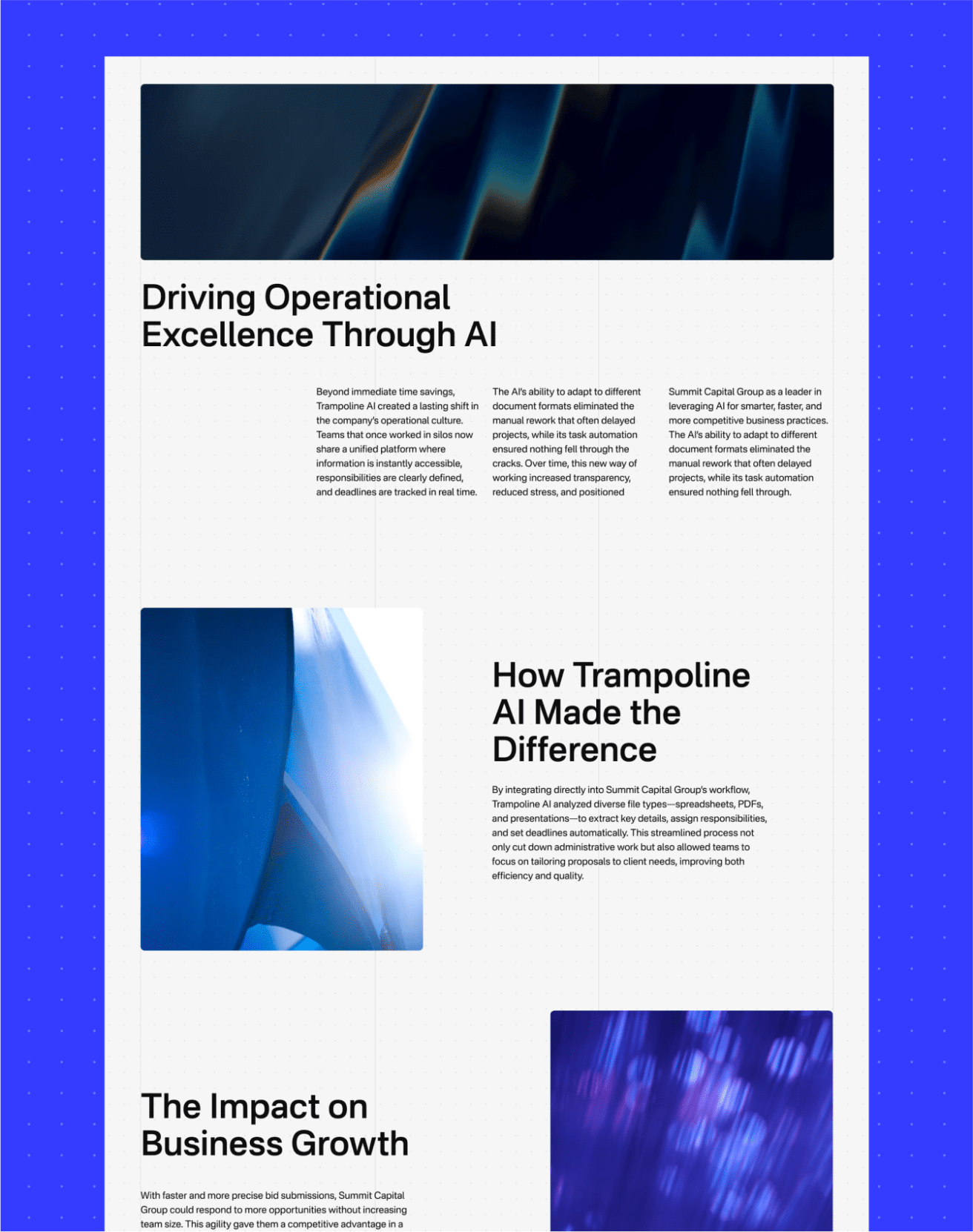
In July 2025, we were commissioned to deliver a strategic and visual redesign of the Trampoline AI website, an evolving company whose mission is to streamline RFP processing through its proprietary in-house AI.
- Energize the website interface and evolve Trampoline’s art direction.
- Simplify and clarify how the solution works through straightforward visual examples to maximize conversion.
- Integrate interactive modules into our designs to make navigation as smooth and impactful as possible.
Objectives
Client discovery and visual universe
First, we needed to define what the client expected from the website and how they planned to implement it internally.
We held an initial exploratory workshop. After receiving a desired site structure and a variety of inspirations from the client, we curated multiple references built around two opposing directions to create a funnel effect and quickly narrow down our creative paths.
The two main directions were:
Playful on one side, and Corporate on the other.
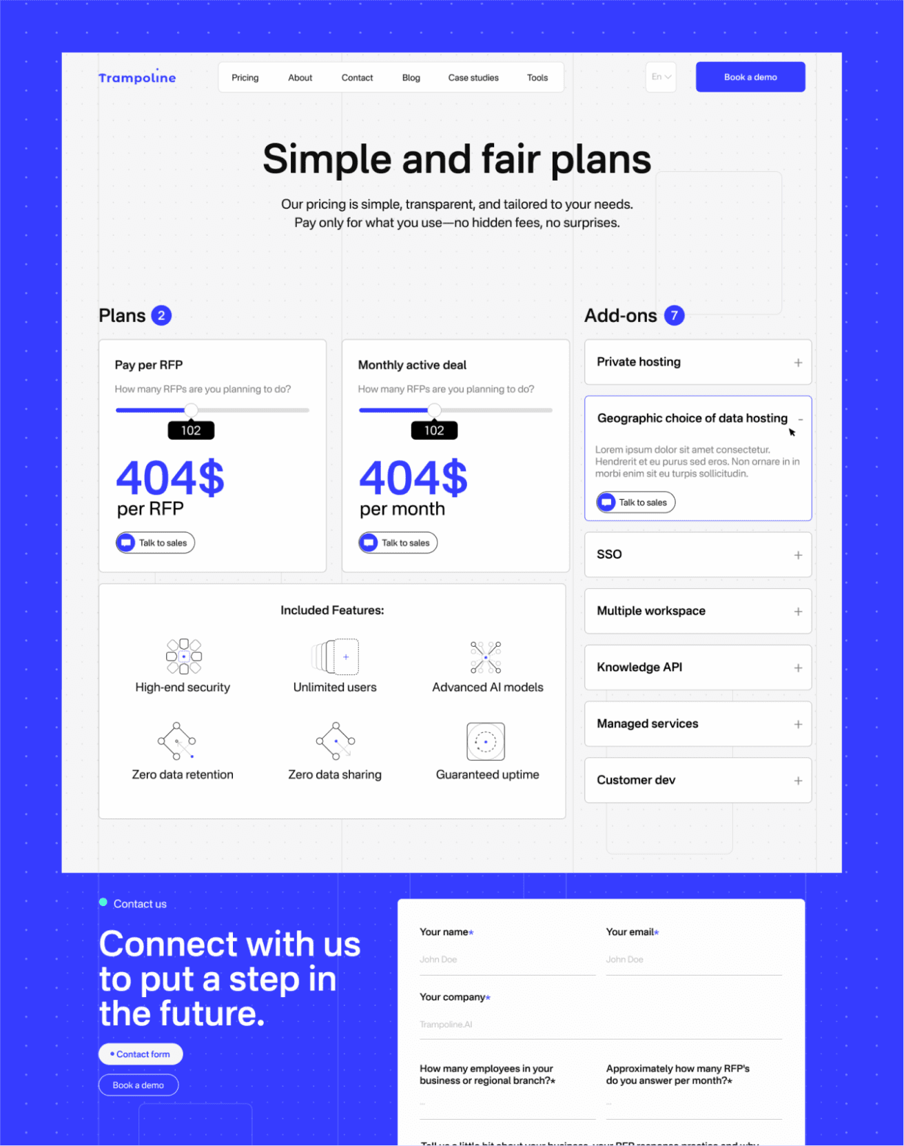
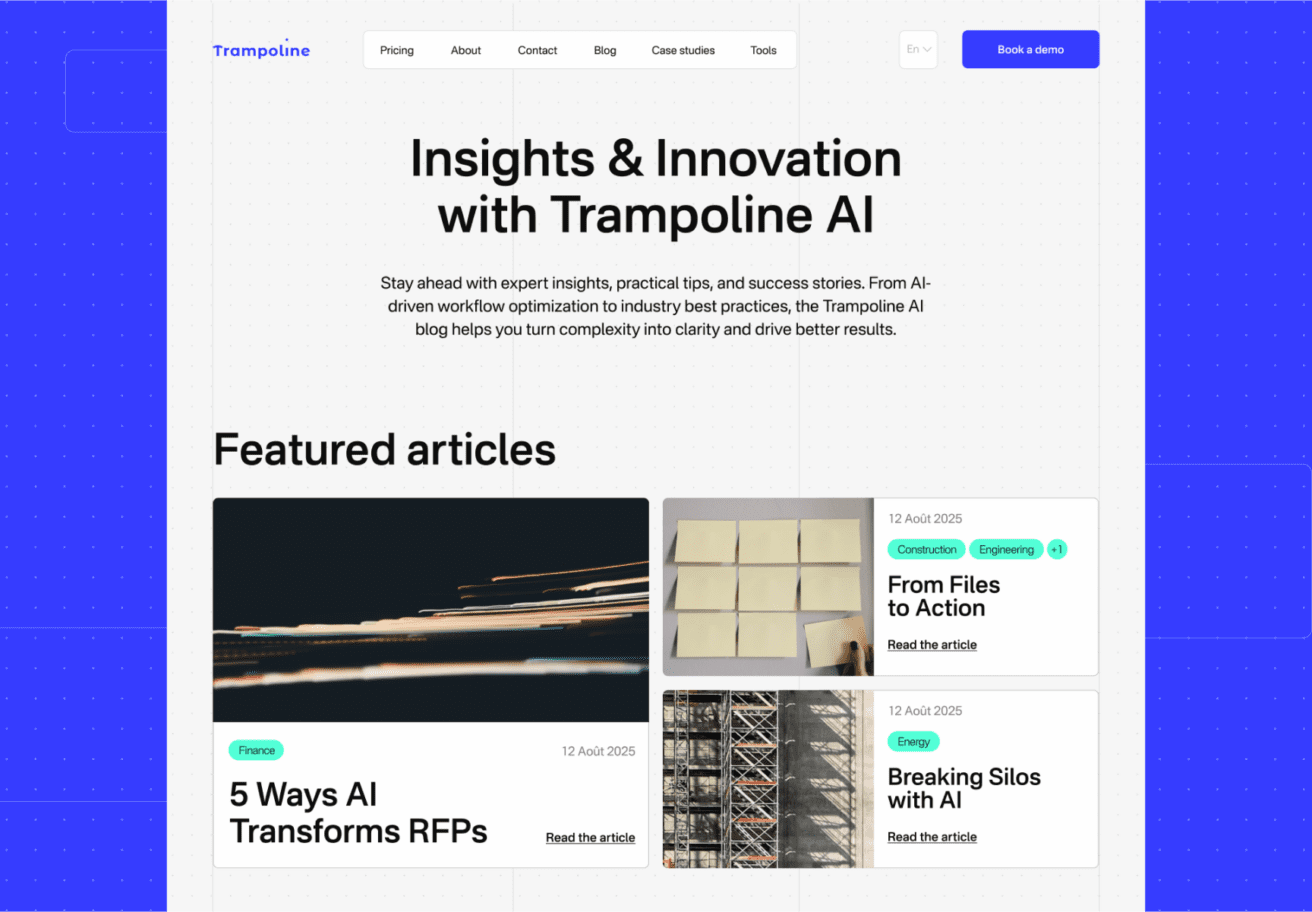
We then ran a workshop where we presented between 5 and 10 different references, focusing the discussion on what the client liked and disliked. They explained that they wanted to highlight a minimalist product demo to make the solution easier to understand for prospects and ultimately maximize conversion.
The conclusion was to propose a more business-oriented direction, preserving the brand’s serious tone and staying aligned with its core audience, while maintaining a “playful” feel within the demo experience.
Interaction at the heart of the mandate
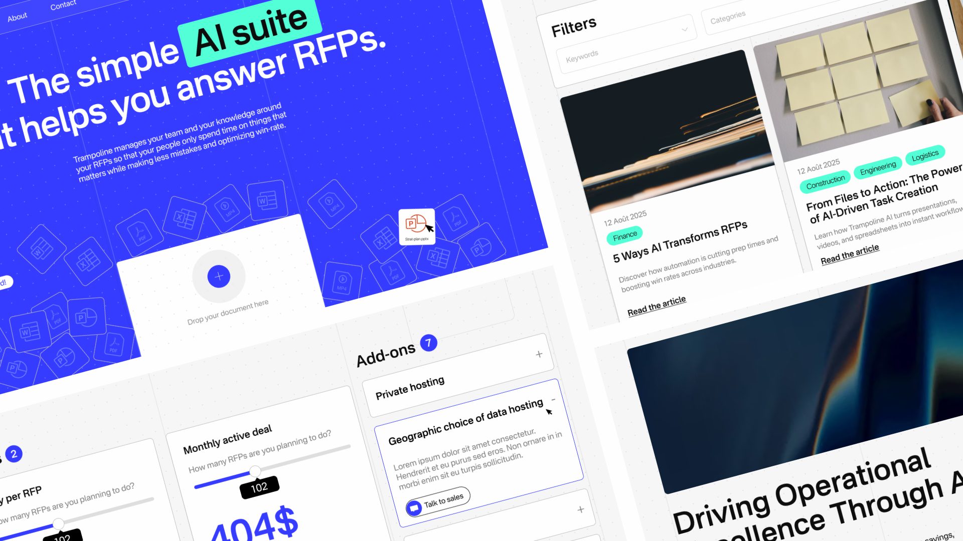
Following a second presentation, our assessment led us toward a friendlier, more rounded direction. The key insight was to highlight the main elements that would take on an animated approach, namely the Hero, the demo, and navigation components such as carousels.
We also agreed that adding animation to text elements on scroll, as well as subtle background textures, would reinforce a more premium feel. Using Lottie for the demo and for certain illustration elements was also chosen to streamline development and facilitate the implementation of complex animations.
Using prototypes for efficiency
Using Figma prototypes saved significant time during the validation of the simplest modules. After that, we moved into animating the modules in After Effects, using our prototypes as storyboards.
Modules included:
- the hero and the transition between the hero and the demo
- the pricing module
- the card module where cards “stack” onto one another
- client testimonials
- scroll-driven interactions, including animated icons
An iterative approach
To minimize time loss and stay aligned with our process, we produced these modules using AEUX. We then delivered a client presentation to demonstrate how the site would behave in context.
By sharing Figma links and Frame.io review links, we gathered feedback and secured approvals on the site’s interactive behaviors.
This mandate required special attention to the demo and the icons—both exported via Lottie, since they needed to comply with the technical constraints of the JSON format.