Cegep Champlain
St. Lawrence

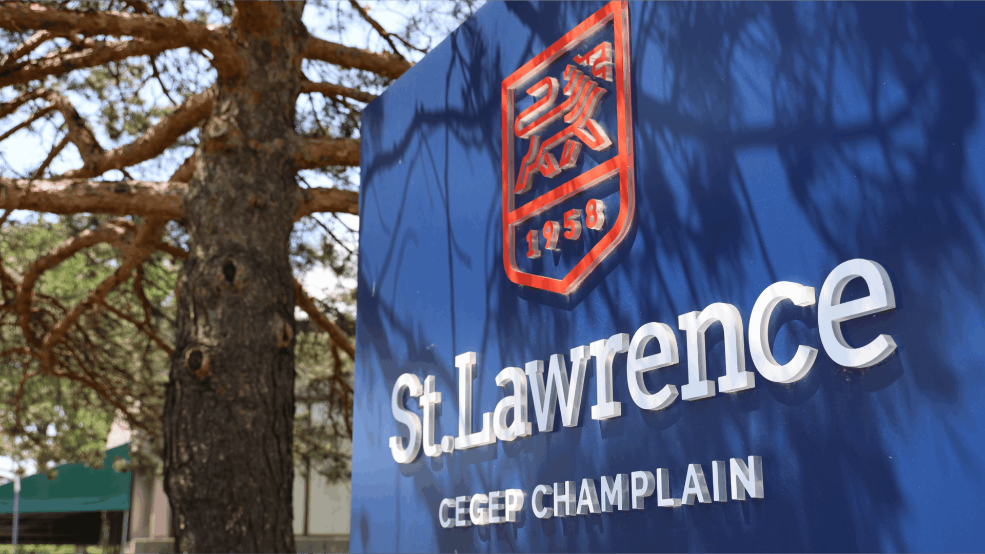
Cegep Champlain - St. Lawrence
Education
WordPress
Showcase website
2025


Mandate
Design a bilingual, accessible digital platform while rethinking the user experience to make it more intuitive. The site had to reflect the college’s new brand image, developed in 2024 by Lemay Michaud, and highlight its distinctive positioning.
Objectives
- Comply with all governmental standards for security and accessibility.
- Deliver a fully bilingual experience (French and English).
- Simplify and modernize navigation for intuitive use.
- Showcase the college’s mission, vision, and values.
- Support student and staff recruitment efforts.
- Integrate and respect the college’s new visual identity.
- Modernize the digital presence to make it more appealing and relevant.
- Provide performance indicators (KPIs) to analyze traffic and usability.
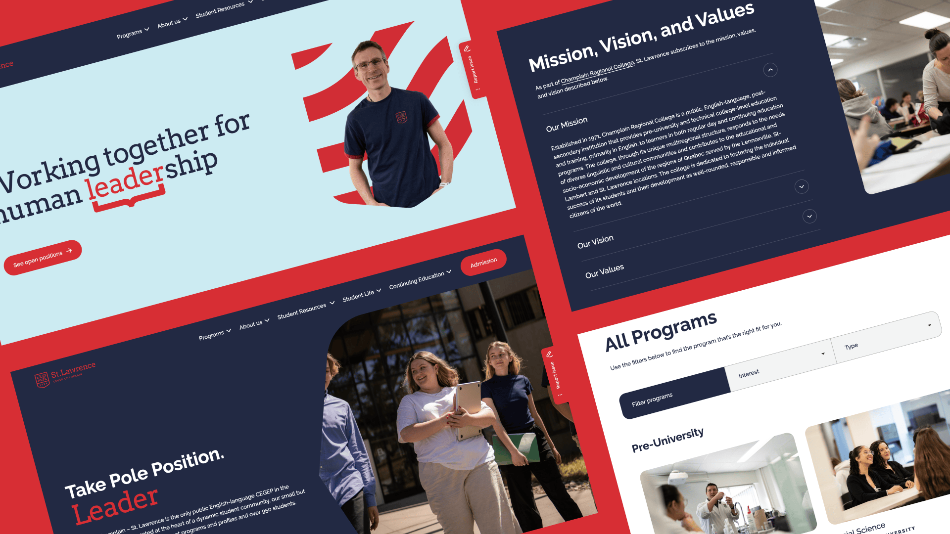
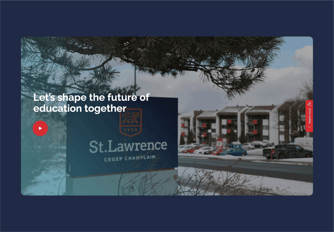
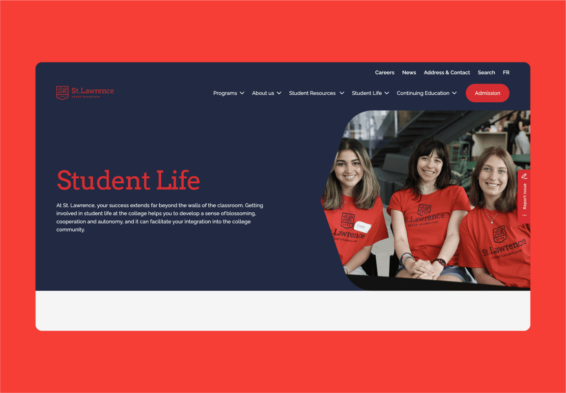
A Design in St. Lawrence Colours
The previous site, limited by its CMS, had not yet integrated the new brand identity.
Our design team drew inspiration from the college’s visual identity to create a cohesive digital universe:
- The lion from the logo was featured in full-width banners for strong visual impact.
- The shield shape was used as a graphic mask for images.
- A horizontal variation of this shape was applied in headers.
A specific challenge involved creating a secondary visual identity to strengthen the employer brand. We developed a dedicated page template for the Careers section to distinguish it from the sections targeting prospective students, current students, and parents.

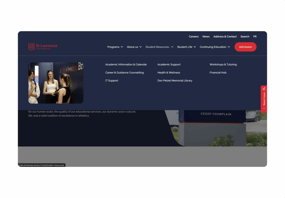
A Completely Reimagined Navigation
Navigation on the former site was a major pain point—finding relevant information was difficult.
Through an in-depth strategic phase, we restructured the site architecture to achieve a clear, intuitive menu.
For longer pages (e.g., individual program pages), a secondary navigation bar follows scrolling, enabling quick access to key sections via an anchor-link system.
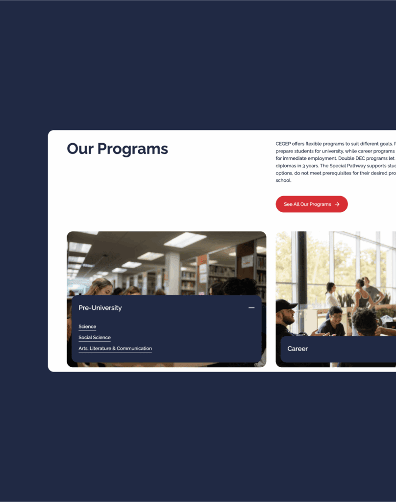
A Dedicated Space for Academic Programs
All programs are now centralized in an interactive, filterable catalog, offering prospective students a clear, engaging overview.
Each program page follows a consistent, easy-to-compare structure:
- Key information at the top (admission season, duration, areas of interest, admission requirements).
- Integrated course grids directly on the site (instead of PDFs), accessible by profile and French-language level.
This approach improves transparency and simplifies decision-making for future students.